Google Calendar Has Been Completely Redesigned And It's So Much Better
Google has pushed a long-overdue redesign to Google Calendar. It's live on the web version right now, and it's everything I've ever dreamed of while clicking my way through a schedule.
The new design features much larger date icons, new colors, a flat card design in line with Google's overarching design philosophy, and a much cleaner overall aesthetic. Basically, it doesn't look like the Palm Pilot calendar circa 2002 any more.
In addition to design differences, Google has added functionality with extra content in event cards. You can now add details about conference rooms, like what kind of AV equipment they have or whether they're wheelchair accessible. You can also link other Google Docs right in to an event card, so if you're having a meeting to discuss the Q2 financial projections, you can have a link to that spreadsheet embedded.
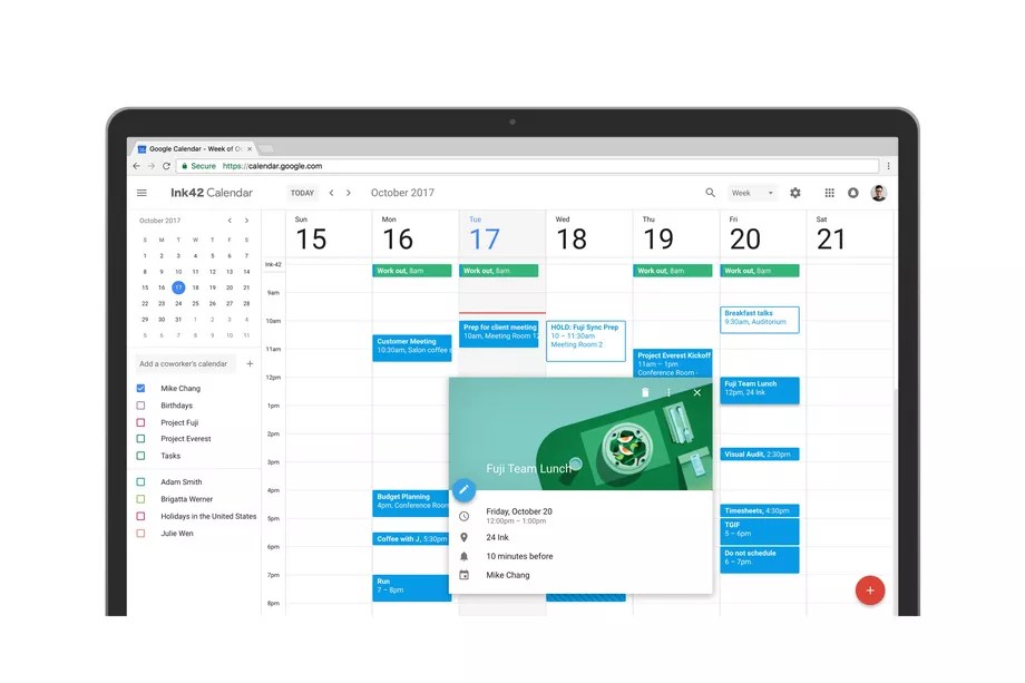
The other big change is the ability to view multiple calendars on the same Day view, which is a big change for any organizations that use multiple different calendars for different workflows.
The changes are live on the web version of Google Calendar right now for anyone who wants to opt-in. Just go to Google Calendar, and there should be a link in the top right to "Use new Calendar." If you want to revert, just click Settings –> Back to classic Calendar.