
We found out this week that 2016 was the hottest year ever recorded, further supporting the consensus that the Earth is getting gradually warmer due to human activity. Year over year, we don’t necessarily notice a difference, but when you zoom out a bit and look at a full century’s worth of temperature data, the change is much more dramatic. NASA’s new timelapse video allows us to do just that, and it’s the most terrifying 20 seconds you’re likely to see today.
With data going back to 1880, the clip shows a gradual ebb and flow of temperature, at least for a while. In more recent years, however, the the oranges and reds envelope the cooler blues. The change is especially dramatic starting around the 1970s through today, where it’s hard to spot any sign of cooler temperatures muscling in.
“Globally-averaged temperatures in 2016 were 1.78 degrees Fahrenheit (0.99 degrees Celsius) warmer than the mid-20th century mean,” the agency explains. “This makes 2016 the third year in a row to set a new record for global average surface temperatures. The 2016 temperatures continue a long-term warming trend, according to analyses by scientists at NASA’s Goddard Institute for Space Studies (GISS) in New York. NOAA scientists concur with the finding that 2016 was the warmest year on record based on separate, independent analyses of the data.”
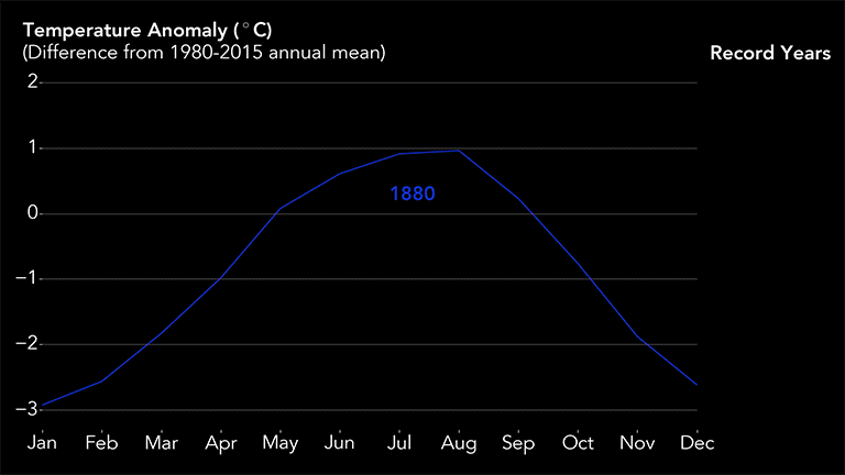
If you prefer a year-by-year comparison of the data, there’s also a handy — and equally scary — GIF that utilizes the same temperature data:
Any way you slice it, the planet is absolutely getting hotter, and it’s up to us to decide what we’re going to do about it.


