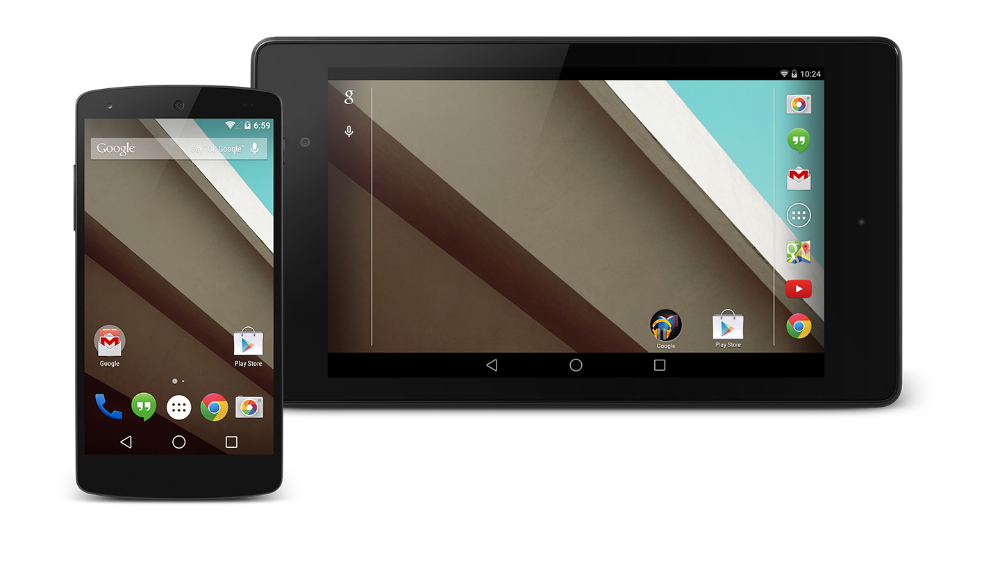
One of the main features of Android L is Google’s complete design overhaul of the operating system’s user interface. Android L is peppered with Material Design elements that make it come to life in a more playful manner, and hopefully they make it even easier to use as well. Google is leaving behind the blacks and grays in favor to a more vivid palette of colors throughout its apps, and PhoneArena has already put up an extensive screenshot comparison showing the differences between Android L and Android KitKat.
The first obvious change concerns the on-screen buttons that have been completely redesigned, reminding us more of game consoles than of Android menus. Also, obvious is the extensive use of colors throughout Android L apps and settings.
Moving on to apps, users will quickly discover in Android L new icons for settings, new sliders, new radio buttons, and will notice that there aren’t that many separation lines between various elements, such as contact lists, settings options or even keyboard buttons.
Screenshots showing how certain apps, including Settings, Contacts, Calendar, Gmail, Email, Search, Maps, Gallery, Play Music, Drive, Keep and Hangouts look like in Android L and Android KitKat are featured in the comparison. You can find some of these images below, with all of them available at the source section.


