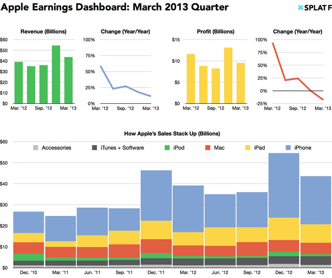
Apple’s earnings report was as action-packed as ever on Tuesday evening. The company’s stock soared as it beat the Street’s consensus and announced that it will return $100 billion to investors by end of 2015, and then it got pummeled when CEO Tim Cook suggested that we won’t see any big new product launches in the June quarter this year. Volatility in the market aside, Apple still turned in a huge, huge quarter despite seeing profits plunge 18% thanks to tightening margins. Looking at the numbers on paper is one thing, but SplatF’s Dan Frommer put together put together a quick “Apple earnings dashboard” that charts key data points as compared to historical data to help tell a more complete story. A few charts follow below and the full dashboard can be found on Frommer’s blog.
Apple’s March quarter in charts
Updated Dec 19th, 2018 8:41PM EST
If you buy through a BGR link, we may earn an affiliate commission, helping support our expert product labs.
Zach Epstein has been the Executive Editor at BGR for more than 10 years. He manages BGR’s editorial team and ensures that best practices are adhered to. He also oversees the Ecommerce team and directs the daily flow of all content. Zach first joined BGR in 2007 as a Staff Writer covering business, technology, and entertainment.
His work has been quoted by countless top news organizations, and he was recently named one of the world's top 10 “power mobile influencers” by Forbes. Prior to BGR, Zach worked as an executive in marketing and business development with two private telcos.


